
Too Much Light...
Designs for uniquely interactive theatre

The Client
The Lunt-Fontanne Theatre of Waukesha
The Project
The audience calls the action for 30 plays over 60 minutes
This theatrical production was a playfully meta and minimalist anthology, whose most charming conceit has the audience determine the order in which thirty 2-minute plays are performed by shouting out the number of the one they want performed next. Each mini-play in turn encourages varying levels of audience participation, making every performance a unique experience.
Deliverables:
Show logo, poster, and social media assets
30 icons to act as thumbnail posters for each 2-min play
Menu-style program for audience members to select their play(s)
Icon Design Process
Since the mini-play icons would be foundational to the experience, the show's look and feel began here.
Each of the mini-plays were titled with a play on words, usually revolving around a humorous or dark twist that became apparent over the 2-minute run-time. Boiling these plays down to simple imagery was a fun challenge.
The process started loosely with pencil sketches to hint at the play's theme without giving away the twist.
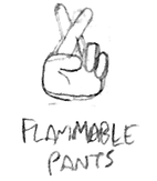
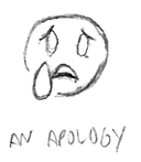
These are how 5 of the 30 icons started on paper...


Once a concept was reduced as simply as it could go, the sketch would be imported and cleaned up in Adobe Illustrator...

"Macbeth"

"Flammable Pants"

"An Apology"

"Days of Wine & Roses"

"Genre Play: Horror"
The Show Program as Menu & Instructions
When the audience needs more from their program than actor bios.


The play's director wanted the show program to be an interactive menu and instructional guide.
Now that each of the 30 mini-plays had its own icon as a kind of logo and mini-poster, it needed to be combined with a numbering system and corresponding legend to help orient the theatre-goer.
Show Logo & Poster
Leaning into the quirkiness
The play's full title is certainly odd, and researching its etymology was little help. The playwright came up with the name from a case study of a young autistic child who would smash light bulbs and repeat, "Too much light makes the baby go blind. Too much light makes the baby go blind." Later, when he was creating this show, the saying came back to his mind.
What did help, as it turned out, was starting from the individual mini-plays and working my way up to the overall show title. With a minimalist visual language established, the show's title could be reduced to basic pictogram elements.
High-contrast colors and bold fonts would grab the prospective theatre-goer's attention, while the oblique title and quirky imagery could then engage their curiosity.
